Is your online marketing ready?
Every year marketers begin to ponder the future of web design and what are the latest features that will prosper. Every year we get excited about the potential.
What is in store for technological trends this year?
New capabilities and technologies are created every year, however it takes a while to measure the effectiveness of these new technologies. This is because they tend to be incorporated into sites as they are renewed or updated.If it were an incremental update in existing websites maybe the process would be quicker. 2015 was said to be the year of Responsive Design, and that certainly has been our experience at Cracking Media as well as all of our sites since 2014 have been built to be responsive.
What has been the effect of moving to responsive?
Though we build bespoke websites to the requirements of our customers, there has been a move to template websites with responsive capabilities. Because of this, many websites often have the same look and feel to them.
Was 2015 the year for Video?
Yes.
Video of course has become much more common in our every day lives. Youtube’s role on the Internet has changed. People now use it as a search engine to find information they are looking for. Examples include ‘how to’ videos, product demonstrations as well as entertainment and music. In 2015, social media has also brought in ‘auto-play’ for Facebook, and Periscope for Twitter allowing for a worldwide audience. These trends look to be on track to continue.
#shoutout to 2015 trends… #throwback #tb #vine #instavid #periscope #youtube
What about the trends for 2016?
With all of that in mind, there doesn’t seem to be any talk of a particular trend to be expected in the year 2016. Here are some of the things we have heard and think about possibilities for web design.
Simple, fast designs VS Responsive, Original Websites
Users are continuing to navigate through content very fast. Designs are therefore probably likely to stay minimal or as simple as possible. If your design is very complex or it takes too long to load, the user may not wait long enough for the content.
Responsive design is here to stay, and will continue to be tweaked and improved. Responsive design seems quite a popular idea for differentiation and making your website original. It is vital that you find that balance between innovation and making sure that the website is fully functional, convenient for the user and has fast navigation.
Things like animation or GIFs are being talked about as new styling techniques for web design in the near future. In terms of design, this provides a lot of opportunity for web designers to experiment or create original content for websites. Using animation and GIFs should be done in moderation as they are elements that will take a long time to load on a website. Ultimately if there are a lot of animation on the website too, your customers may not wait around to even see the amazing content you have worked so hard to design.
Flat Design or 3D?
Generally web design much like fashion, will go back and forth with trends. We are currently in a period where designers choose flat designs with priority being given to quick navigation and a clean look. So the usual debate of whether we are about to see a change again is happening now. With brands such as Google changing their branding to a simpler, flat design it is very much a possibility that we haven’t quite finished with flat designs just yet. Perhaps flat design will be something that continues for a couple of years but evolves in other ways so that the website speed is not compromised by making more complex designs.

Is how much we use mobile devices inspiring desktop layouts?
We think so… Have you noticed on any websites that when you go to the menu, the menu button is the typical symbol with 3 lines that lead to a drop down? Well that button was originally designed just for the mobile layout of people’s websites. Now, this button is used again to create a clean, simple appearance to the website, but it’s a universally understood icon and if you are a web designer, it makes for an ever so simpler html code! (every little helps..)
Think about when you are visiting websites online, or using social media? Our behavior and expectations from those experiences usually involve an awful lot of scrolling. But when we are on a desktop, we expect to see a menu and navigate through the website easily by choosing exactly where you want to go. It has been questioned whether on desktop layouts; we will begin to see long scrolling designs, where all of the content is on one page. This does mean that depending on the type of content that you will include and the quantity of it, it could take a while to load your site. Short navigation involves lots of pages and articles on separate pages which is possibly clearer but may put a lot of obstacles in front of the user when they are making decisions about what content they are looking at.
A side note…
To give you some perspective, Augmented Reality has been a trend that has been talked about for years. Even now this is something that is being worked on and discussed. We’ve seen snippets of it occasionally like in the VR Rollercoaster App (on Android), Zombie Shooter VR game or even the Tuscany Drive Virtual Reality holiday retreat for you to escape to. But it’s unlikely that we will be using a more developed version of this technology this year. In fact, who knows if the technology will even reach its peak in the next 10 years? Time will tell…
Our thoughts
The speed at which trends are taken up is always controlled by 2 factors. The first is marketing and business seeing an application for the technology. The second is user acceptance and whether they feel it has a place in their lives.


 More users are viewing online campaigns with their mobiles than ever before, and that trend appears to be accelerating. Marketing to mobiles tends to produce a response that is different to those of traditional methods.
 Traditional marketing methods have seen circulation, viewers and readership decline, which has effectively pushed up the price of each interaction and lowered return on investment.
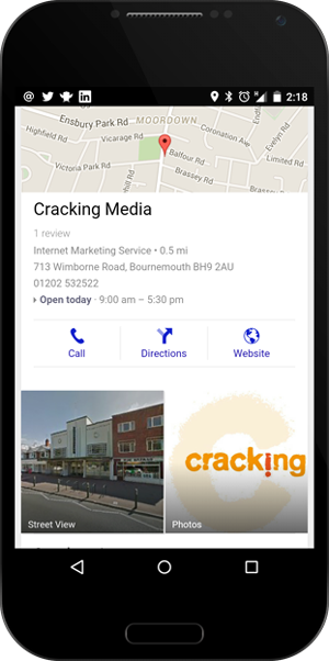 Whilst many paper-based maps have either been consigned to a cupboard or drawer or even to the recycle bin, online maps today are everywhere, on our car sat nav, our computer and even on the smartphone tucked in our pocket or handbag. Finding local information or directions to a place we need to go to has become very accessible, literally at our fingertips.

 There is nothing like the inner fury of British people when the queue system is not adhered to. You’ve been there, seen the queue cutters, the queue ignorers and the very notion offends you. Why does it? It’s etiquette, an expected social norm. Not surprisingly then, networking has its own social norms and thus its own etiquette.
 Networking. Do you feel it? The sheer horror at the thought of having to interact with people you don’t know. If you are hit by despair when confronted with a networking event, don’t worry you’re far from alone.