 Online Website Marketing Blog
Is Your Website Ready For 2015?
Is Your Website Ready For 2015?

Websites have become an increasingly important marketing tool for business over the last 20 years, and today most businesses will have a website with differing levels of interactivity based on their needs. This can range from a simple online brochure with contact details through to ecommerce, directories, informational, online communities, forums and many more.
Everything changes and websites are no exception
Websites go through changing trends and fashions just like everything else in the modern world, this can driven by evolving technology, the needs of business and the requirements of website visitors.
Website Trends for 2015
Whilst it’s relatively simple to have a website, are you missing out on the increased traffic that modern web trends could bring you? Are you missing opportunities whilst your competitors are taking a lead?
Responsive Design
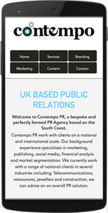
Website visitors are increasingly more likely to visit your site on a mobile phone or tablet and it is widely accepted that the amount of web users accessing websites on a mobile has overtaken those using traditional computers. This is set to continue and increase throughout 2015. Today’s mobile devices typically have a smaller screen than regular computers or laptops, which can cause websites to display incorrectly or make them hard to read as website text can be very small and buttons hard to navigate. Responsive design uses different techniques display your website in a much more user friendly way.
Accessing a website on a mobile device brings up another consideration which is orientation. As you can see in these images websites often need to respond to different landscape and portrait shape screens making the best use of the space available.
By making your website accessible on multiple devices you are ensuring that all of your customers can have the best experience when visiting your site.
The images clearly show that the screen size and orientation are different yet the website has responded to this providing the same content but displaying it in a way that best suits the screen it’s displayed on, making it much easier for your customers to interact with your site.
Who you gonna call? Ghost Buttons…
 A new idea that is becoming increasingly popular is ‘ghost buttons’. You may be asking yourself ‘what on earth is a ghost button?!’ Don’t worry I thought the same thing until I was shown an example. Ghost buttons are a transparent and empty button filled with a plain text which can fit perfectly over a large image. This makes it easier on the eye as the web page isn’t full of different colours. This is a very modern approach to buttons, but I think they work really well and I expect that these will become increasingly popular in the upcoming months.
This links in with my next point, ‘Bigger images are better’. Over the years we have seen the love for visual social media like Instagram and Pinterest increase dramatically and it shows that images have a big impact on customers. Larger images with text overlay allow readers to digest information without having to read large amounts of text. ‘A picture speaks a 1000 words’
However BE CAREFUL…
Larger images will take longer to load therefore if you have an image taking up the majority of your website and it hasn’t it hasn’t been optimised for the use of the web; this could result in lagging and loss of customers if they aren’t willing to wait for loading time.
Have a video!
 Having a video on your website can improve more than just how the website looks. Video takes up less room than large amounts of text that a lot of users who visit the site may not even read. A video is also a lot like telling a story therefore you can get information across visually and audibly – saving visitors time. An indexed video stands about a 50 times greater chance of ranking on the first page. – Real SEO (the marketers guide)
Did you know 80% of your online visitors to your site will watch a video whilst only 20% will actually read the content on your website?! – Digital Sherpa
What do you prefer? Scrolling or clicking? I prefer scrolling and it just so happens that scrolling is becoming more popular in the recent months. Newer websites are having fewer buttons. This can be a good thing as scrolling keeps a visitor in their reading flow and therefore more likely to read more information.
When you look on a website you expect them to be user friendly and give accurate information instead of being a confusing, complicated and hard to understand. All these changes to your website can make a HUGE impact to your target audience and essentially bring in more customers.
Have you got your website ready for 2015? Or have you seen any other new trends? Leave a comment below telling us about your findings.


 There is nothing like the inner fury of British people when the queue system is not adhered to. You’ve been there, seen the queue cutters, the queue ignorers and the very notion offends you. Why does it? It’s etiquette, an expected social norm. Not surprisingly then, networking has its own social norms and thus its own etiquette.
 Networking. Do you feel it? The sheer horror at the thought of having to interact with people you don’t know. If you are hit by despair when confronted with a networking event, don’t worry you’re far from alone.


